From Bioblast


![]()
![]()
![]()
 |
Scaling - DatLab |

MitoPedia O2k and high-resolution respirometry:
O2k-Open Support
Description
Scaling a graph in DatLab provides flexibility to vary the display of the plots and create Graph layouts. It allows viewing a data plot in differently scaled graphs, zooming the signal and time scales, and scrolling along the axes of the graph provide maximum information on the current experiment. This does not influence the format of stored data. Different ranges for the axes change the appearance of data dramatically. It is highly recommended to use reference layouts.
»Compare: Select plots - DatLab.
Abbreviation: F6

MitoPedia O2k and high-resolution respirometry: DatLab
Graph \ Scaling
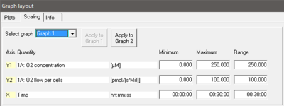
- Open window: Either select Graph-Scaling in the menu bar or with a left mouse click on the X-, Y1- or Y2-axis to open the window Graph layout Scaling.
- Select graph Pull down to select any of the defined graphs.
- Minimum Defines the minimum axis position (suppression) for the display of data at a constant range.
- Maximum Defines the maximum axis position for the display of data at a constant range.
- Range Define the range of the Y1 axis (left), Y2 axis (right) and X axis (Time). Select a predefined Graph layout from the options in the pull down menu. Edit the Graph layout name by a left-click on the name, and left-click Save to save the entire graph layout.
- Apply to Graph 1 The scaling defined for Graph 2 is applied to Graph 1.

Arrow keys

- Use arrow keys to scrol (data on Y-axes), pan (time on X-axis), or zoom (expansion or compression: Ctrl+arrow key), independet of the F6 window.
- Select the active plot in a graph by a left click onto the label of the plot in the figure legend on the right. The active plot is highlighted. Scrolling and setting marks apply to the active plot.
- ↑ or ↓ : Scroll up and down the Y axis, with a shift of 50% each time of the active plot.
- Ctrl+↑ : Magnify the signal (half the signal range is displayed).
- Ctrl+↓ : Cover a larger range on the screen for overview (twice the signal range is displayed).
- → or ← : Panning, shift 50% of the time axis to the right or left. During data acquisition, switch off automatic panning to pan backwards without changing the time range.
- Ctrl+→ : Magnify the time resolution on the screen (decreasing the time range). It expands the data, half the original time range is displayed. The upper limit of the time range is fixed.
- Ctrl+← : Cover a larger time range on the screen. It compresses the data, twice the original time range is displayed. The reference time point is fixed on the right during zooming in and out.
Example
- Y1-axis: Concentration [nmol/ml=µM]; a range of 200 and Start at 0 is chosen after calibration to show the oxygen concentration in the full range (0-200 µM) without amplification.
- Y2-axis: Flux [pmol×s-1×ml-1]; Range of 300 and Start at 0 shows flux from 0 to 60 pmol×s-1×ml-1 when the oxygen signal is calibrated [µM].
- X-axis: Range 1:00 h and Start at 35 min presents data starting at 35 min, over a 1:00 h time interval from 35 to a maximum of 1:35 h.